
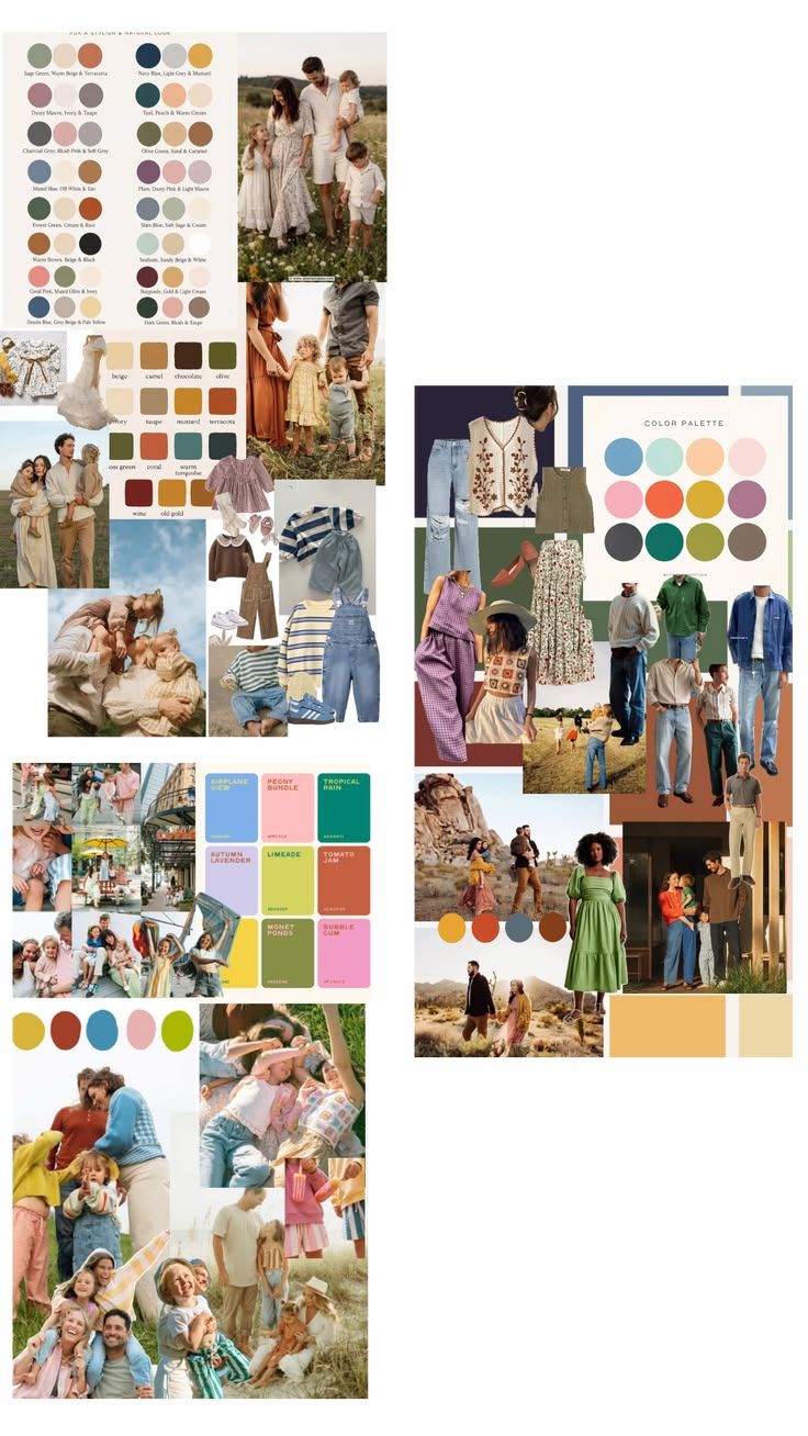
LAYERING COHESION, IN SHORT
Cohesion comes from repetition, not matching. Repeat two or three colors across the group and vary who wears which. A sage cardigan on one person and a sage bow on another does more than everyone wearing the same shirt.
Layer for texture, not just warmth. A knit over a woven shirt, denim under a linen dress, a vest over a tee. Mixing textures is what makes a group look styled instead of coordinated in a hurry.
Go easy on bold pattern. One statement print in the whole group is plenty, like a floral dress or a gingham shirt. Once you add a second bold pattern, outfits start competing with each other instead of with the scenery.
When in doubt, keep it simple. White and cream on everyone is the easiest palette there is. It always looks classic, works with any backdrop, and photographs well in every season and light.
1. GOLDEN HOUR NEUTRALS
Fields, tall grass, warm open light
Soft, sun washed and heirloom in feel. Everything sits in the same warm family: sage, terracotta, olive, cream, so the group reads as one story even when every outfit is different.
Palette: Sage · Warm beige · Terracotta · Chocolate · Olive · Mustard · Slate blue · Ivory · All white and cream with jeans or khakis
Layering help:
- Anchor with one linen or cotton neutral. An off white shirt or ivory dress worn by an adult, then build everyone else's color out from it.
- Add one textured mid layer. A knit vest, chunky cardigan, or corduroy overalls in olive or chocolate breaks up a sea of solids.
- Let one person carry the terracotta or mustard. A rust dress or mustard sweater lets the warm tone read as an accent, not a repeat.
- Roll sleeves and cuff pant hems slightly. It keeps flowy fabrics from looking too styled.
- For the simplest version of this palette, put everyone in white or cream tops and jeans or khakis on the bottom. It's the easiest combination to pull off and it never looks dated.
Keep in mind:
Denim is the built in unifier here. Jeans or a chambray shirt sit comfortably next to any other color in this set.
Stick to one busy print maximum (a small floral or gingham) and keep it on the smallest layer, like a headband or collar.
Avoid stark white paired with true black. It'll pull focus from the warm palette and read cold against the field or light setting.
2. DESERT JEWEL TONES
Rock formations, dry brush, late day sun
More saturated and a little more adventurous: navy, rust, mustard and olive against a dusty desert backdrop. This palette carries pattern well. Embroidery, gingham, and floral all read as intentional rather than mismatched.
Palette: Navy · Rust · Mustard · Olive · Plum · Teal green · Sage mint · Charcoal
Layering help:
- Start from denim or khaki on the bottom, worn in jeans, wide trousers, or a chino, then let color live in the tops.
- Layer a lightweight vest or button up over a plain tee. An embroidered or knit vest over a white or olive base adds texture without adding a second loud color.
- One patterned piece (floral skirt, gingham pants, crochet top) per two or three people is the sweet spot. Enough to feel curated, not like a costume.
- A hat or a warm toned accessory (rust belt, straw hat) is an easy way to tie an outfit into the palette without buying new pieces.
Keep in mind:
This palette can take more contrast than the neutrals set. Navy next to mustard or rust reads intentional, not clashing.
Balance one bold print with solids on everyone else in the same shot.
Skip neon or true black. Against desert tones they'll look like they belong to a different shoot.
3. BRIGHT CANDY PASTELS
City streets, beach grass, playful and in motion
High energy and a little nostalgic: sky blue, brick red, blush pink, mustard and limeade together. Best for candid, laughing in motion shots rather than posed portraits. The palette does the work, so outfits can be simple.
Palette: Mustard gold · Brick red · Sky blue · Blush pink · Limeade · Tropical teal · Lavender
Layering help:
- Keep every layer a single solid color. This palette is about color blocking, not mixing prints, so let a red sweater sit next to a blue tee rather than adding pattern on top.
- One striped or gingham piece is plenty for the whole group. It can be the thread that visually ties two colors together.
- Cardigans or button ups worn open over a contrasting tee let one person carry two palette colors at once. Tie it at the waist for kids who won't keep it zipped.
- Distribute the brightest colors (red, mustard) across the group rather than putting them all on one person, so the eye moves around the frame.
Keep in mind:
This is the one palette where head to toe matching per person is fine. Save the mixing for what different family members wear, not within one outfit.
Avoid mixing in the muted tones from the other two palettes (olive, taupe). They'll read dull next to this much saturation.
Simple silhouettes (tees, straight trousers, sundresses) work best. Let the color carry the outfit instead of a busy cut.
A FEW THINGS TRUE ACROSS ALL THREE
- Odd numbers of pattern. One or two patterned pieces per group photo is plenty. More than that competes for attention.
- Vary the weight, not just the color. Pair a flowy piece with something structured (denim, cotton twill) so outfits don't all look the same texture.
- Shoes matter more than you'd think. Bare feet, simple sandals, or worn in boots read better on camera than bright white sneakers, in every palette here.
- Avoid logos and text. Graphic tees and branded logos date photos quickly and pull the eye away from faces.